What was the problem?
C-Breez is a technology platform that enables hoteliers to both publish their rates and offers via OTAs and tour operators, as well as help sell their own vacations and flights directly from their website.
Their hotel & flights booking platform UI was not user friendly and customer feedback as well as the Google analytics revealed they were struggling to complete checkout on mobile.
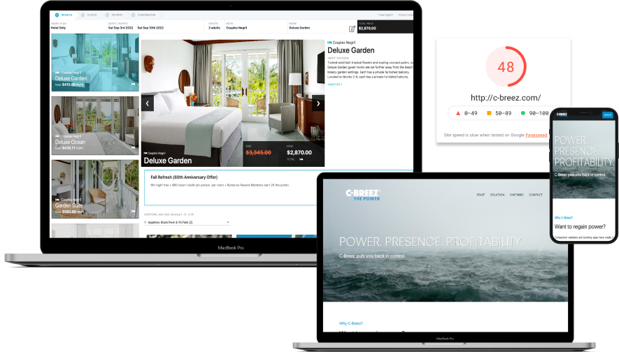
From initial investigations I found their two year old marketing website was slow to load (48 out of 100 on Google Pagespeed). I was tasked to help redesign their marketing site and booking platform. The client requested me to:
1. Refresh our brand marketing website to showcase our credibility and expertise.
2. Improve the aesthetics and UX of the booking portal, so that it looks and feels like an enterprise / heavyweight SaaS application.
Plan the work and work the plan.
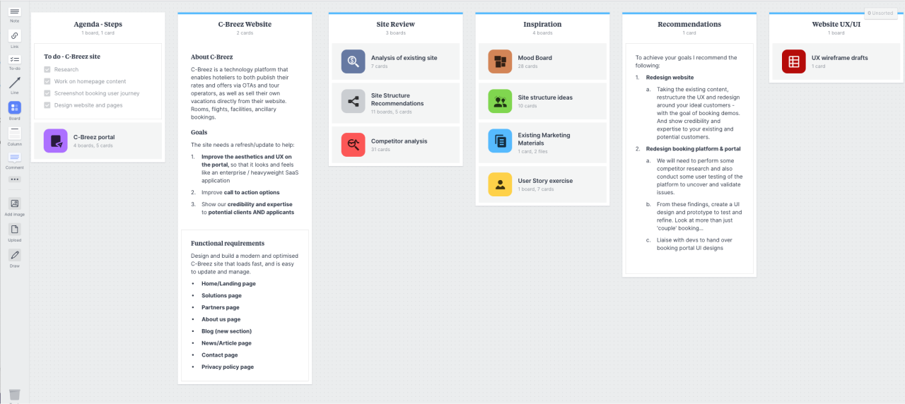
After consultations with the client, I laid out a plan of action following my process. I created a shared board in Milanote that set out their project requirements and my recommendations.
Each section was clear for the client to view the process; from competitor research, UX analysis, customer feedback, user stories, the importance of regular user testing, design systems to creating low and high fidelity wireframes.
1. C-Breez Website
1.1. Content first before design
C-Breez was keen to redesign their old website first before tackling the larger, more complex booking platform, so I started work on their website with a view to setting up a UI design system in Figma to retain consistency in the design of both their website and booking platform.
They already had spent money with a brand agency to produce a well-written Powerpoint sales deck that outlined their proposition and story.
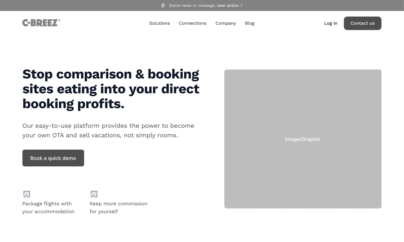
Using this content helped me to break the website structure down into scannable, micro copy and then layout out each landing page design to help tell their story and keep users engaged.
1.2. Applying the UI design
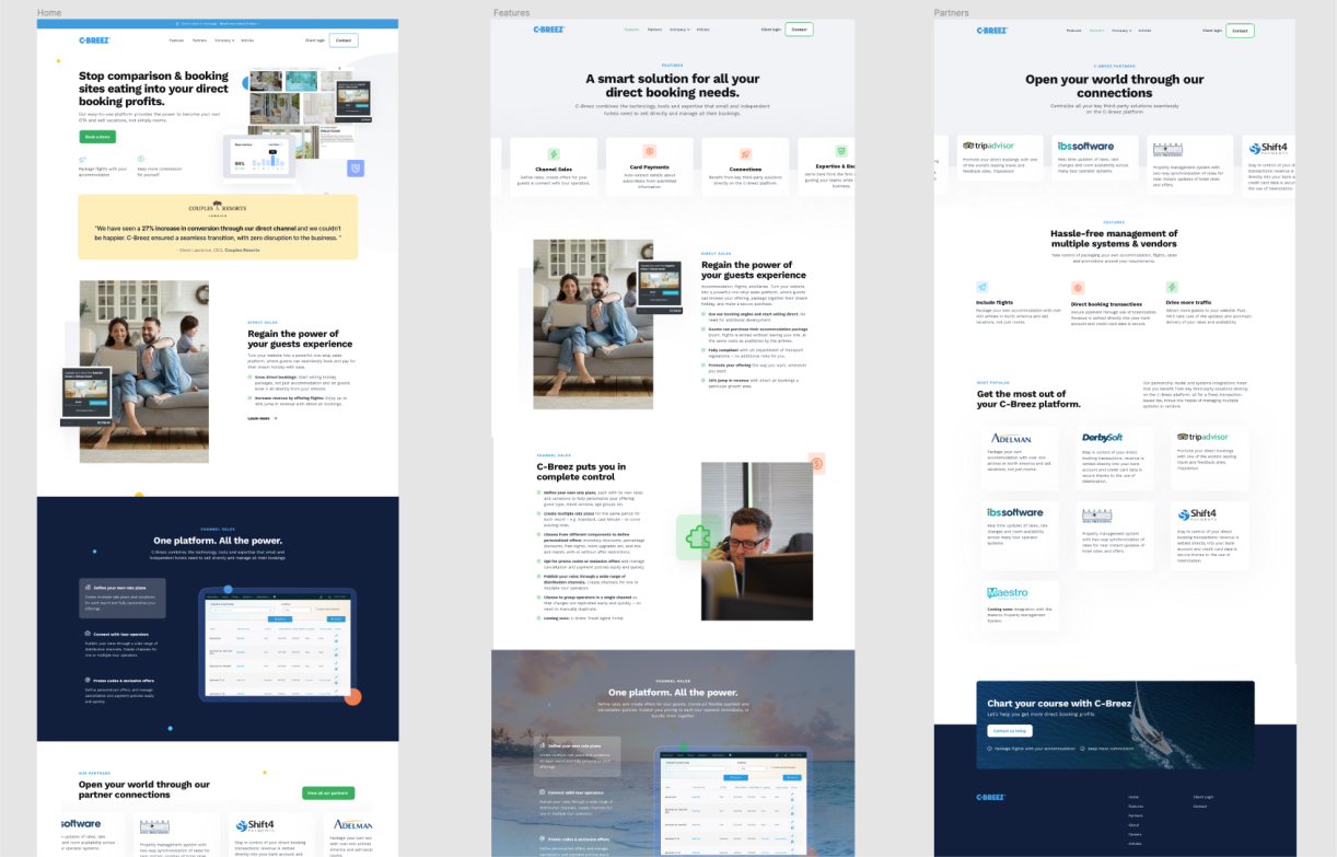
Working from these wireframes, their content and existing imagery, I redesigned the website in Figma. This also helped define the foundations for the C-Breez UI design system, including selecting a complimentary Google font, Work Sans to better match their C-Breez logo and refreshed brand identity.
Once the high-fidelity prototype was user tested with a few of their internal staff and customers, and updated, I started on the website build directly into Webflow.
1.3. Laying out the website
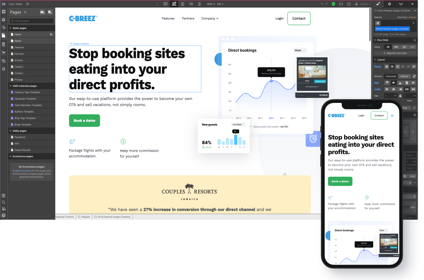
Building their website directly into Webflow gave me the opportunity to really learn this ‘no-code’ tool to; design and setup responsive pages, create UX micro-interactions, setup SEO page descriptions and structure the content management system.
Within a month of launching we achieved their goal of a modern, hi-spec marketing website to showcase our credibility and expertise and increased Google Pagespeed performance to 97%.
Marketing and sales were happy. Now we needed to work on the C-Breez booking platform.
2. C-Breez Booking platform
2.1. Initial user testing
Before we jumped into correcting the issues the client surfaced, we agreed to conduct user testing at this stage before starting any designs and uncover any additional struggles and pain points and set a benchmark to evaluate on future user testing our prototype designs.
Unmoderated user testing
I prepared a script of questions and tasks ready for an unmoderated user testing session with UserBrain – a user testing tool for websites & prototypes.

I wanted to observe how new users go through the C-Breez booking platform, what sites had they used to book travel and accommodations in the past and then go and book a vacation with a set budget.
The users were screened and selected from their US database with an age range of between 18 to 51 years old and split between mobile and desktop devices.
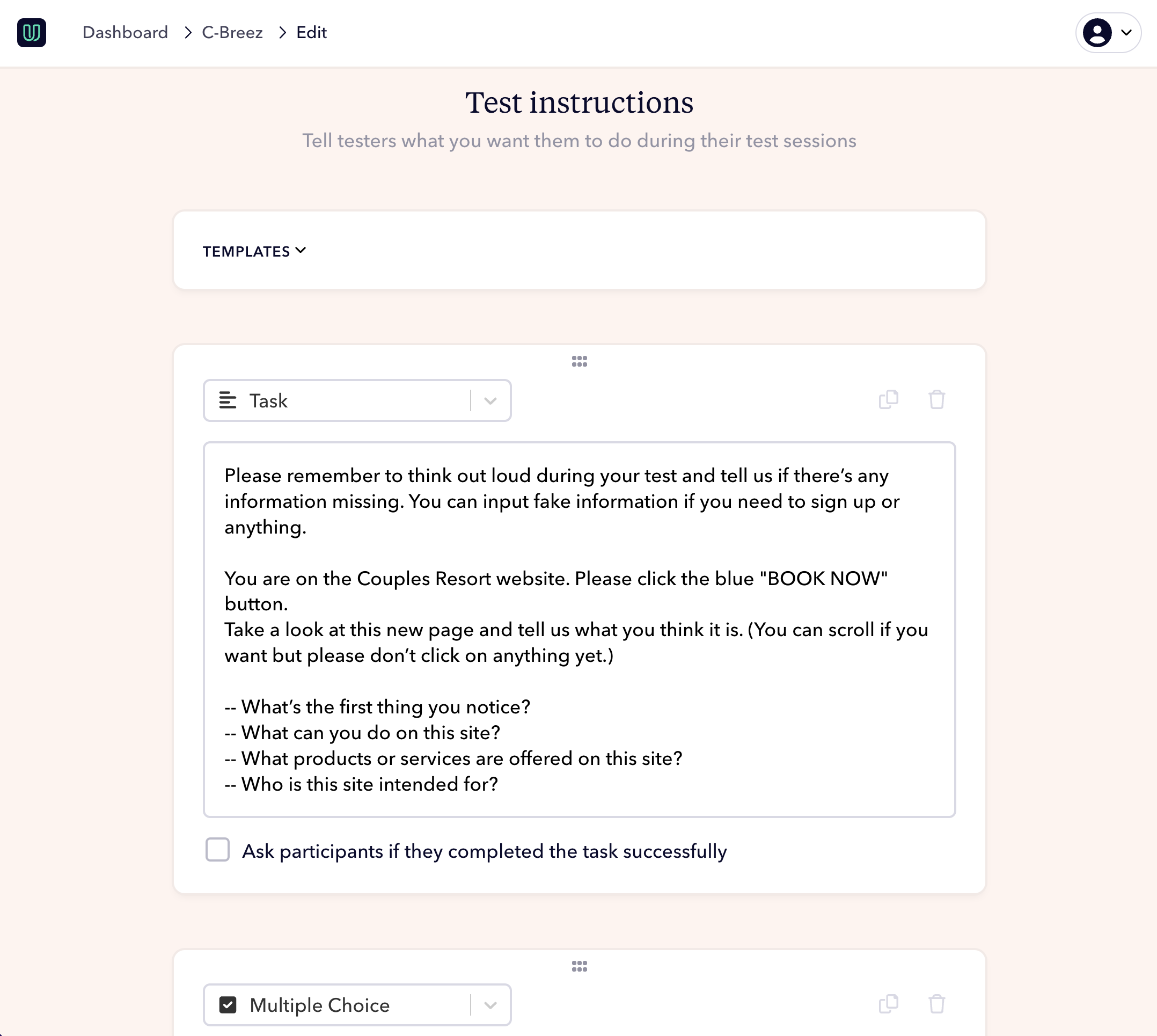
user testing highlights - DESKTOP
“Super confusing how to checkout. I wouldn’t expect to have to go up there to checkout.”
“What’s the whole point of showing ‘Adult 1’ and ‘Adult 2’…? Not necessary.”
user testing highlights - MOBILE
“What’s the Miami airport code? Why can’t I type this in? I’m spending a lot of time scrolling through this and I feel like I would leave.”
“I didn’t see any other add-on options. They would need to be more prominently displayed because I didn’t know there were any.”
2.2. Analysis
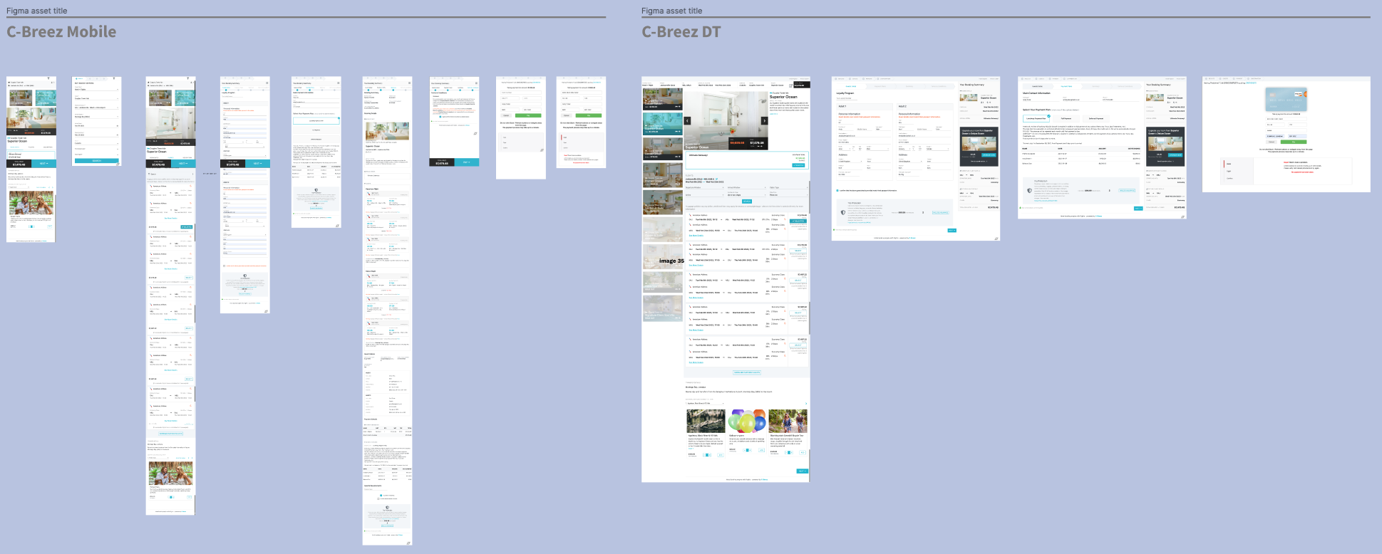
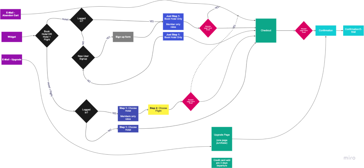
Using the user insights and feedback from the user testing sessions, I screenshot the main flows for both desktop and mobile and worked with the client to map out and define the core user journeys.
2.3. Analysis: Simplify the complexity
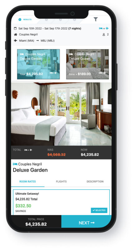
The complexity of the C-Breez booking platform was the ability to choose to book either a:
1. Hotel room or
2. Hotel AND flights package as one price.
This made it hard to display clearly to the user on mobile devices. And also advertising the additional benefits and ‘add-ons’ the hotelier wanted to promote.

2.4. Analysis: Emulate the best
Taking the insights from the user testing sessions and researching best practice travel booking flows, I collated the best-in-class booking site UX examples – like Expedia, Google Flights and Skyscanner to see how they solved their user problems.
This provided some quick-win solutions and ideas that we could emulate and draft wireframe prototype designs.

2.5 UX ideas: Low fidelity prototype
The tracking analytics revealed users tended to exit at checkout on mobile devices, (13%) but most switched to their laptop device (84%) to complete the purchase. We found that users did not trust the mobile experience so it was important to start the designs from a mobile-first approach and solve the user struggles primarily at the checkout – as well as throughout their user experience.
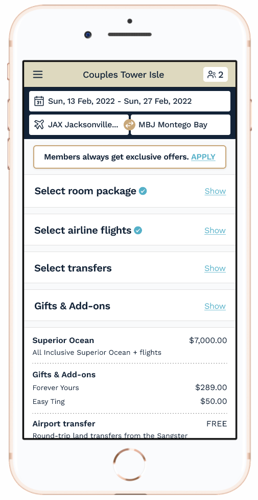
I created content wireframes in Figma first to focus on the user journey and define how we might communicate the hotel and flights package clearly. From my UX research (Nielson Norman Group) and past experience in e-commerce, I settled on creating a one-page checkout flow with expandable sections instead of steps. This helps move the users through the booking experience with speed and ease.

After processing the feedback from client user testing, it gave us confidence that we were in the going in the right direction with mostly positive reactions and users going progressing through to checkout.
But some areas needed tweaking:
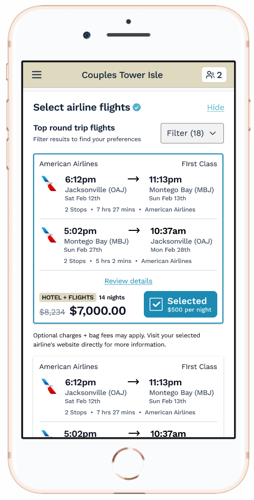
Hoteliers do not want to display the separate pricings for hotel + flights – just on package price. So how do we show this without confusing the user?
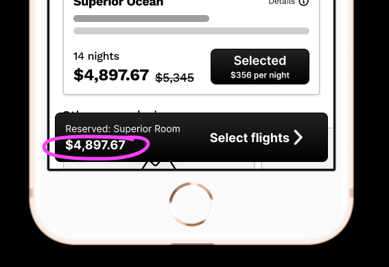
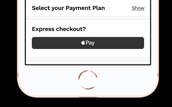
The Apple Pay button was not available to implement for the beta launch so was removed.
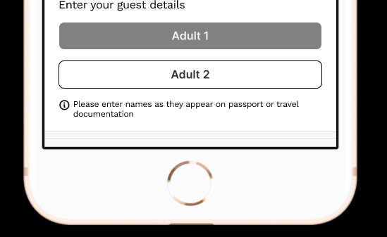
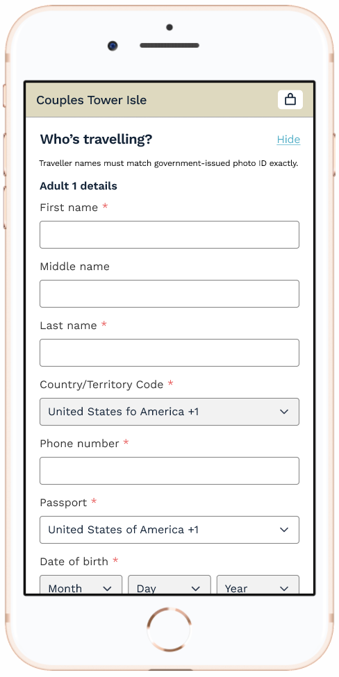
Information required from guests included nationality and telephone number to book flights – details also needed to be shown and not hidden as the user wanted to see additional guest information to check.
2.6. UX design: High fidelity prototype
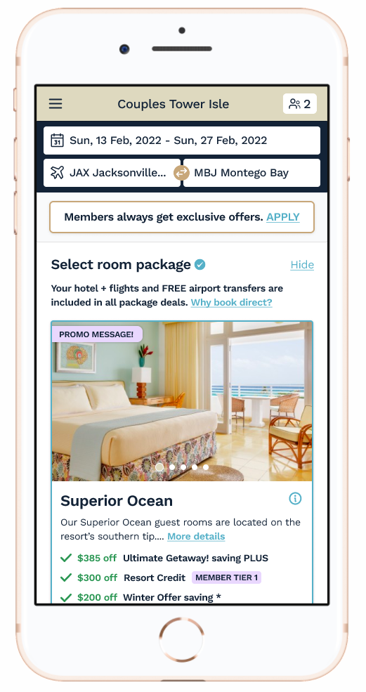
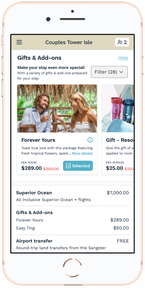
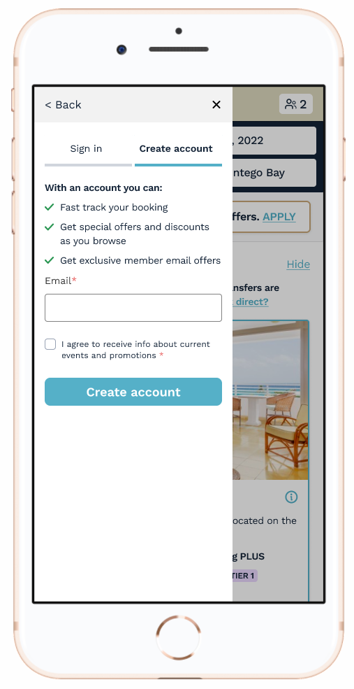
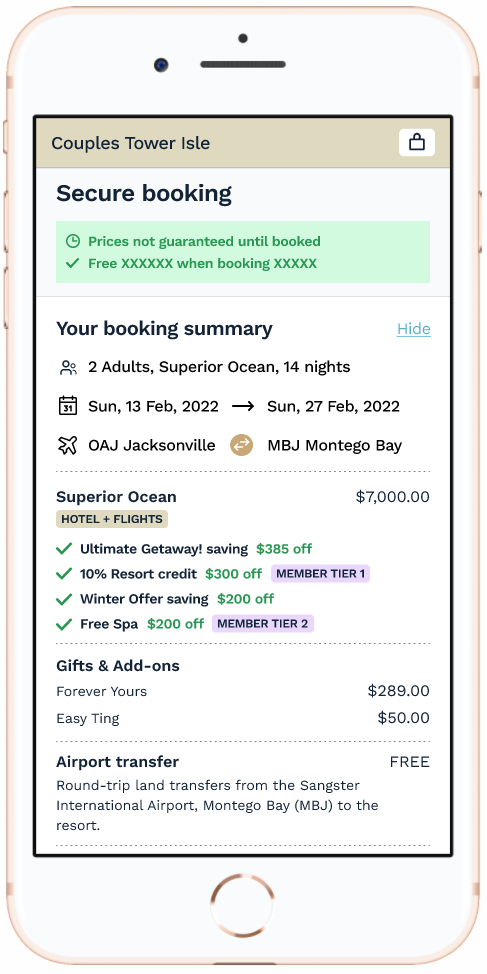
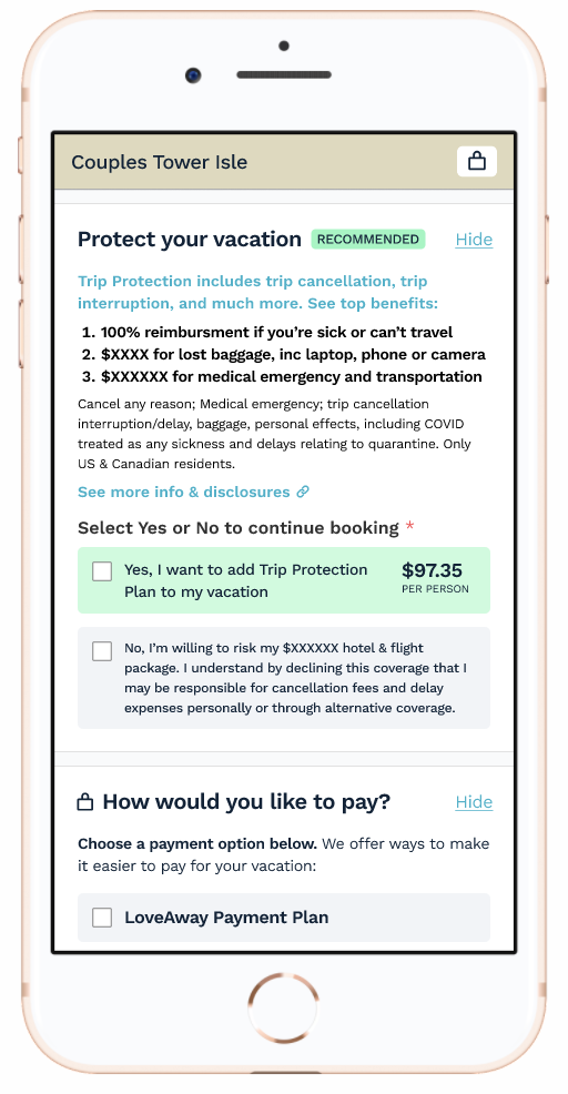
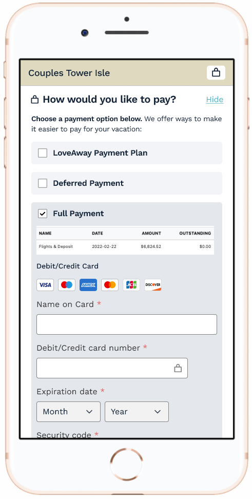
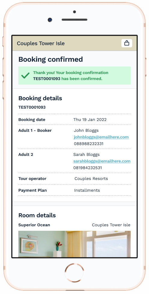
The prototype designs were created in Figma with full interactions to try to bring to life the design and ideas of a simple user journey through this one-page checkout flow. The user is given a pre-selected ‘room package’ that shows what’s included with large thumbnail images, hotel offers, and more details.
Click the button below to experience the full, clickable mobile prototype:
2.7. User testing: High fidelity prototype
These new, high fidelity clickable prototype designs were then tested again with the same user participants who were shown both mobile and desktop designs.
This helped us to not only compare the old booking site to this new UI design experience – but also reveal any additional user insights we missed.
USER TESTING HIGHLIGHTS - DESKTOP
“… I like how you can easily filter the flights. This site is a lot easier to pick and view stuff. The other one was more hidden and you had to play around with it a bit.”
“These little pull outs – I think that’s nice. I like that. This kind of interface for changing your dates makes more sense to me.”
USER TESTING HIGHLIGHTS - MOBILE
“… My first impressions are that it’s detailed, it’s thorough, it’s informative, it’s clean, it’s organised, and there are lots of clear call to actions. It would be nearly impossible to overlook something on this page. All right there and easy to spot.“
“I like that you can filter the Add-ons too because if it’s someone like me I’m always looking for something specific like an excursion, or a dinner or a tour…”
2.8 UI Design System: Optimised and ready for development
To help keep consistency and flesh out the initial designs I created the C-Breez UI design system in Figma. These included the core UI components, accessible brand colours, typography and icons library. These laid the foundations for good UI practice and future product updates and features. It also helped reduce hand-over briefing with our team of developers.

Beta: Booking platform progress
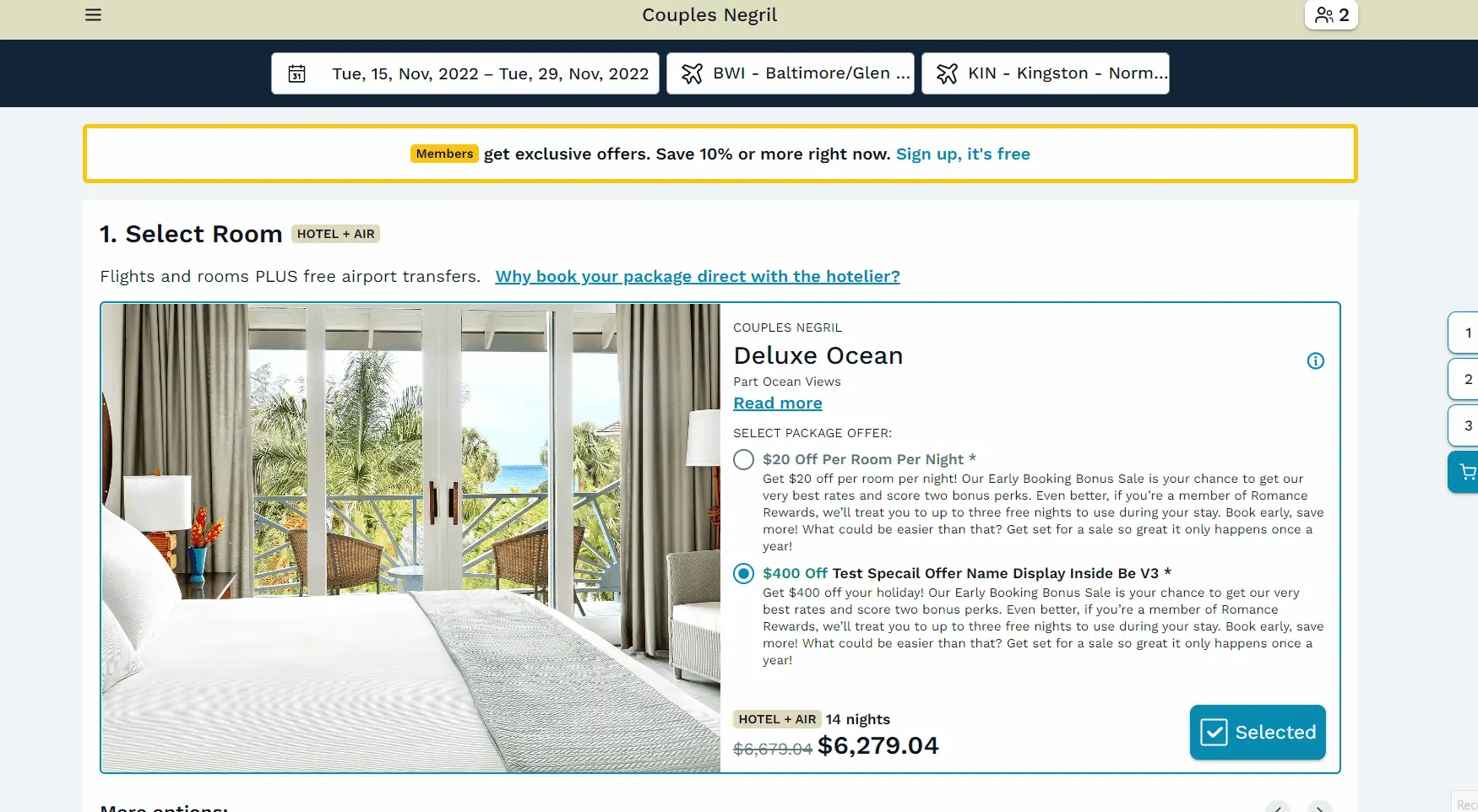
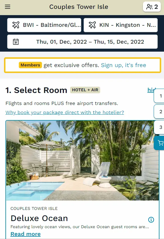
The new new platform UI design is in development. Below are some examples showing our progress towards a beta release.

Desktop: Updating dates & details
This example shows how the animations for slide out modals, dates and overlays were added to highlight selections and prices updates. The addition of the ‘sticky’ tabs follow you down the screen helps the user navigate each section.
Desktop: Flights & filters
When a user changes flight details for a package, or a resort offer we again showed how the animations for slide out modals, dates and overlays were added to highlight selections and prices updates.
Mobile responsive
Below are some examples on a mobile device showing filter slide out modals, gifts selection and collapsible sections helping the user flow through the booking process all in one page.


“Andy’s an asset on our team, always championing the user-first approach. He transformed our product and our website helping towards bookings up by 12% from the previous year.”
Gary McNamara – Chief Executive Officer
