The problem
i4C is an innovative and intuitive cashflow modelling software for financial advisors. After we helped rebrand and launch their new website, they now needed to update the i4C user interface – their core cashflow modelling product – to create a seamless user journey.
Rather than just applying the colours and logo to fit the new i4c brand identity, this gave us an opportunity to look at the usability of the current UI design and improve it.


Design constraints
The i4c software platform was built on a bespoke legacy codebase, and due to the constraints from the developers, we could only tweak certain UI design features.
Working with the Product Manager and the CTO, we confirmed timelines, requirements and they provided an outline PowerPoint user journey of their ideas and processes to be redesigned.
Design directions
The PowerPoint mockup helped us to see what needed to be redesigned for each section of the site and prioritise the UI design to fit their timeline to launch the new version.

Design consistency
Taking the brand designs and elements from the newly designed i4C brand and website, I worked on designing the layout for the dashboard navigation, with the goal of optimising maximum screen space for the client information.

Enhance the UI
The main change was to move the logo to top left, darker colours and redesigning the existing icons. This allowed more room to add to left menu.
Then we replaced the font and increased the size to match the brand consistency and make it easier to read on screen.

Maximising screen size
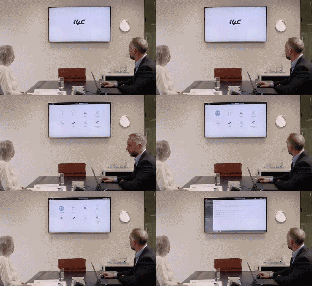
The software was designed to be adaptable to resize to most screens – from an iPad, laptop and a large TV screen to present in client meetings. So to allow more screen width for the graphs, we introduced a collapsable left menu.


Try the clickable prototype below.
(Best viewed on a large screen):

“Andy helped transform the i4C experience for our users and we’re incredibly proud of the new UI design.”
John Calvert-Jones – Marketing Manager
