Do you know the most scary, exciting thing about entrepreneurship?
I believe it’s that business is always changing and evolving. When you?re first getting things up and running, you might have a general idea of the services you want to offer and the clients you want to work with, but as you gain experience in your industry you begin to refine your offerings, your processes, and your brand.
It?s always a treat to work with creative entrepreneurs who?ve spent a few years in business; they have a better idea of the clients they?re trying to appeal to, the items they need to have designed, and the overall visual identity they?re trying to achieve through their brand and website.
In this article, I’ll first go into detail about how I get clients, onboarding them, then showing how I create a unique brand and logo identity using a recent project as an example. Starting from the first meeting to the final launch of their new brand to the world!
It will be a step by step process, from the first meeting to the final launch of their new brand to the world!
Always learning, always improving
When I started my design business, my mission was to provide clear and simple brand and website designs for creative entrepreneurs and growing businesses.
I now have experience working with a wide mix of brands, from corporate clients to tech startups, shop owners and consultants. I understood their pains and issues as they figured out how to create and grow their brand.
But when it became busy, I was multi-tasking on any number of projects at one time. And this caused friction and burnout as I flitted between managing and working on client projects.
One of the hardest things in running a creative business in my experience is following ? and sticking to ? systems and processes. If you speak to any creative entrepreneur, you?ll find that we multi-task and are not very disciplined in keeping to a strict way of doing work. We have inspiration at odd times of the day and night and not just work the 9 to 5. (I love working on new brands for our clients but find it hard sometimes to work on my own business!)
But I?ve been refining my way of working on brand and web design projects over the past year, and am now dedicated to working on just one brand and website project with one client . And completing the project within a 3 or 4 week timeframe.
This keeps the process streamlined and working towards their roadmap and deadline for both the client and myself. And it?s given me more focus than ever before.
The client also knows that I?m giving them my undivided attention and my creative brain to working on their brand and website design.
How I?get clients
The majority of my clients will have either come from a client referral or googled and searched for a logo brand designer and then reviewed my website portfolio of work.
It goes without saying that you have to really understand a?client’s business, so when I first receive an email enquiry, I will usually reply within a day to their email and ask them to answer a few more questions so I can learn a bit more about their project. The questions I ask may include things like:
- When are you looking to get started on this project?
- Do you have a specific budget you?ve set aside for this project?
- Are you the owner of this project? And should we plan on inviting other members of your team to the initial consult?
- Is this a new type of branding project for you, or have you done it before?
At the end of these emails is an offer of a free 30min brand consult with me to discuss their brand and website project and provide any advice and see if I may help.
If I feel we?re a good fit then I explain my brand and website services and offer my brand roadmapping session. This is a half day, in-depth workshop that is a deep dive into their business and brand and help define who their customers are, their competitors and their company.
The full package I offer if the project requires it after the roadmapping session is the full Brand and Website service ? and the roadmapping fee is credited towards the cost of this if they go ahead.
Within the roadmapping session we sometimes discover that they need more help than just brand and website design, so we put forward best recommendations and breakdown each of the stages towards a roadmap and strategy.
These recommendations usually involve additional help with creating a brand name, to professional photography, video or copywriting.
Creating a brand and website for AgencyBox
When John, the owner of AgencyBox, approached me to design his brand and website, I was thrilled. And before we started the brand and website project, I worked with him to come up with the ?AgencyBox? name and a brand roadmap and strategy. I also helped him set up a simple email capture process on his website to?attract leads. This included a PDF white paper report design as both a free content download when a user provides their email address, to a full-size, printed brochure to post out to prospects.
AgencyBox is a SaaS (software as a service) which aims to help large organisations reduce agency spend through better recruitment agency management. The working title was ?PSL Manager? or ‘Preferred Supplier List Manager’ which didn’t sound very engaging or memorable, so we first needed a new brand name and clear strategy around their target audience before we could start any design.
Coming up with a brand strategy and new name
We spent a couple of days of workshop together to define his brand archetype, his positioning and fleshed out a brand strategy.
From the brand naming workshop, we eventually came up with a strong brand name that fitted well ? and the domain was available to purchase as a .com after some negotiating. ?I recommend not splashing the cash on trying to get a?.com until your business is more established – unless you really feel it will be an asset to the business? (Read why SumoMe bought their new domain sumo.com for $1.5million!)
After coming up with a variety of names and combinations, we finally agreed on one – and the new brand name was born: AgencyBox.com – simple, yet strong and easy to remember.
Designing the logo
Now it was time we started work on creating his brand logo identity. It needed to be consistent, scalable to different sizes and work across all mediums for print and screen.
I start with an inspiration board, gathering images and pairing colours to create a “feel” and an aesthetic to work from throughout the entire project.

John did a great job pulling images together in a secret Pinterest board, and the colour palette of the photos and design inspirations blended in perfectly with some of the adjectives from our strategy sessions, ?confident?, ?fresh?, ?innovative?, ?revolutionary? and ?knowledgeable?
I kept all of those qualities in mind as I moved onto the next step: sketching logo concepts.
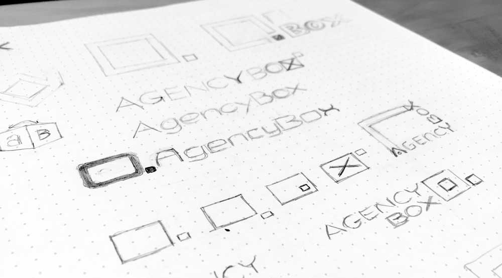
You can see how the inspiration board help focus ideas?within my sketches; I worked on the?square or box shape and the letter shapes. I drafted up a number of variations that focused on simplicity and ease of use of the software.
After digitising the concepts and presenting John with a few distinct logo options, he chose the one below.
There are many variables to consider when designing a logo, but versatility is one of the key things I focus on. The box icon can be used on its own or rearranged into alternative logos to give him more versatility.
These other logo lock-ups are often a better fit for things like email signatures, websites or page footers, etc.

I chose a classic san-serif, humanist font called, ?Keep Calm? which lends itself to a more corporate yet modern look (It?s the same font used in those ?Keep Calm and Carry On? posters from the 1940?s). I tweaked the individual letters – re-creating a new lower-case ?g? and evened out the spacing.

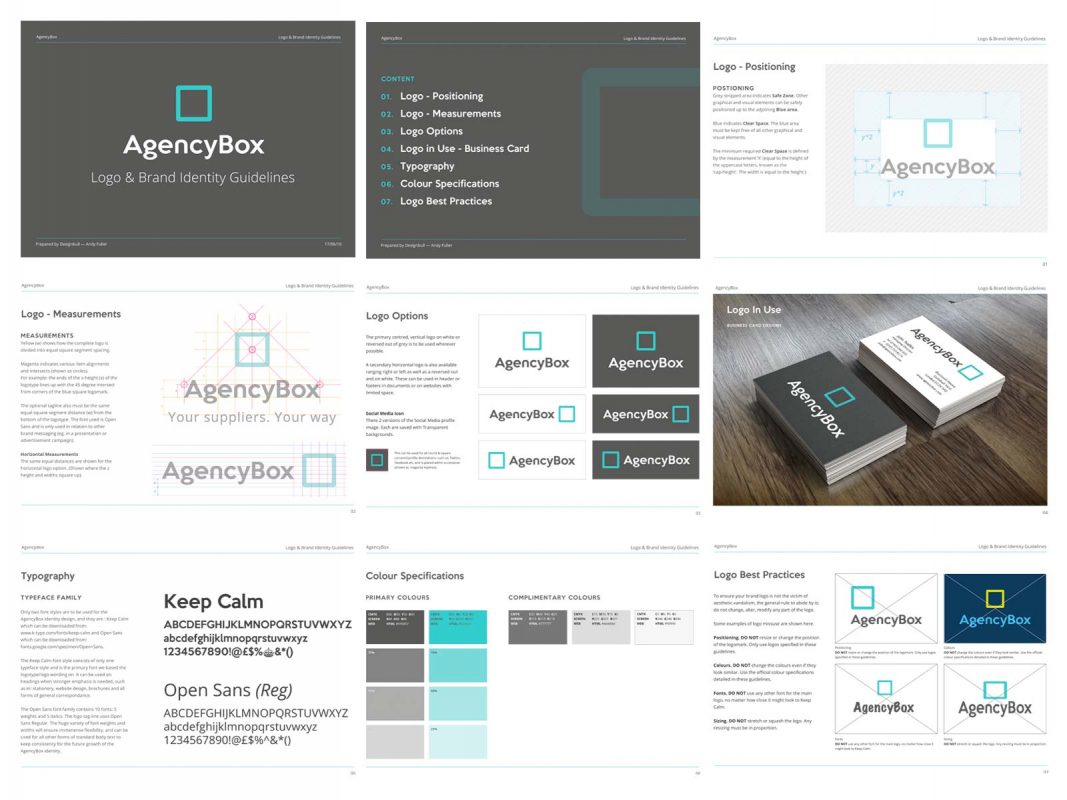
But a brand is much more than just a logo. It really starts to come to life when elements like borders, text, and colours enter the mix during the second stage design phase.
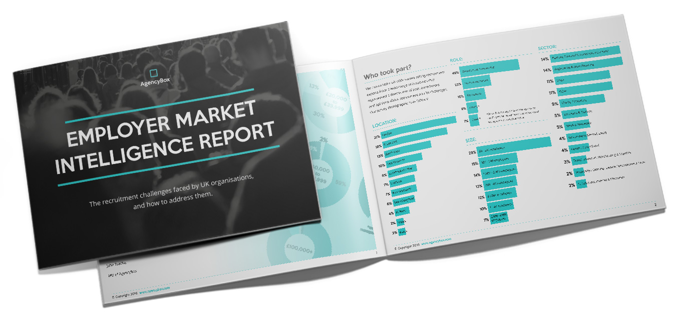
For AgencyBox, I designed a set of unique icons, business cards, corporate stationery, PowerPoint templates, and an A4 report.


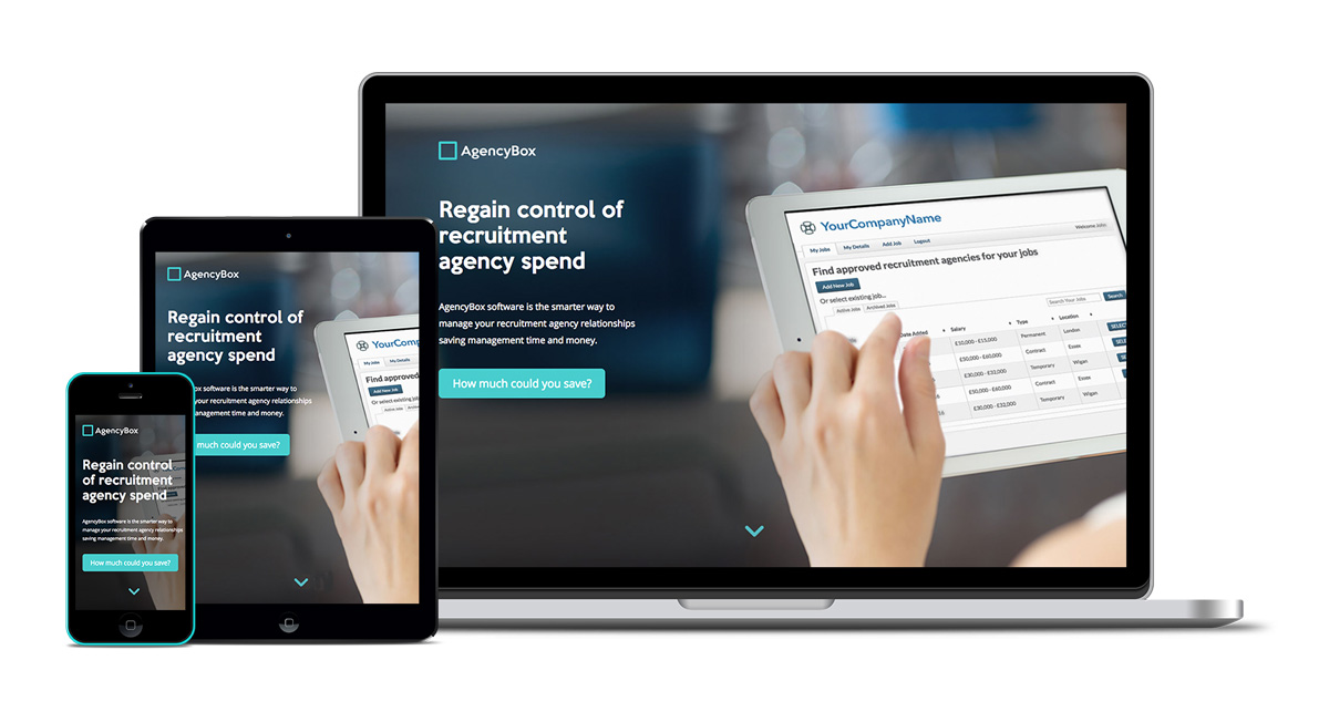
Corporate Website Design
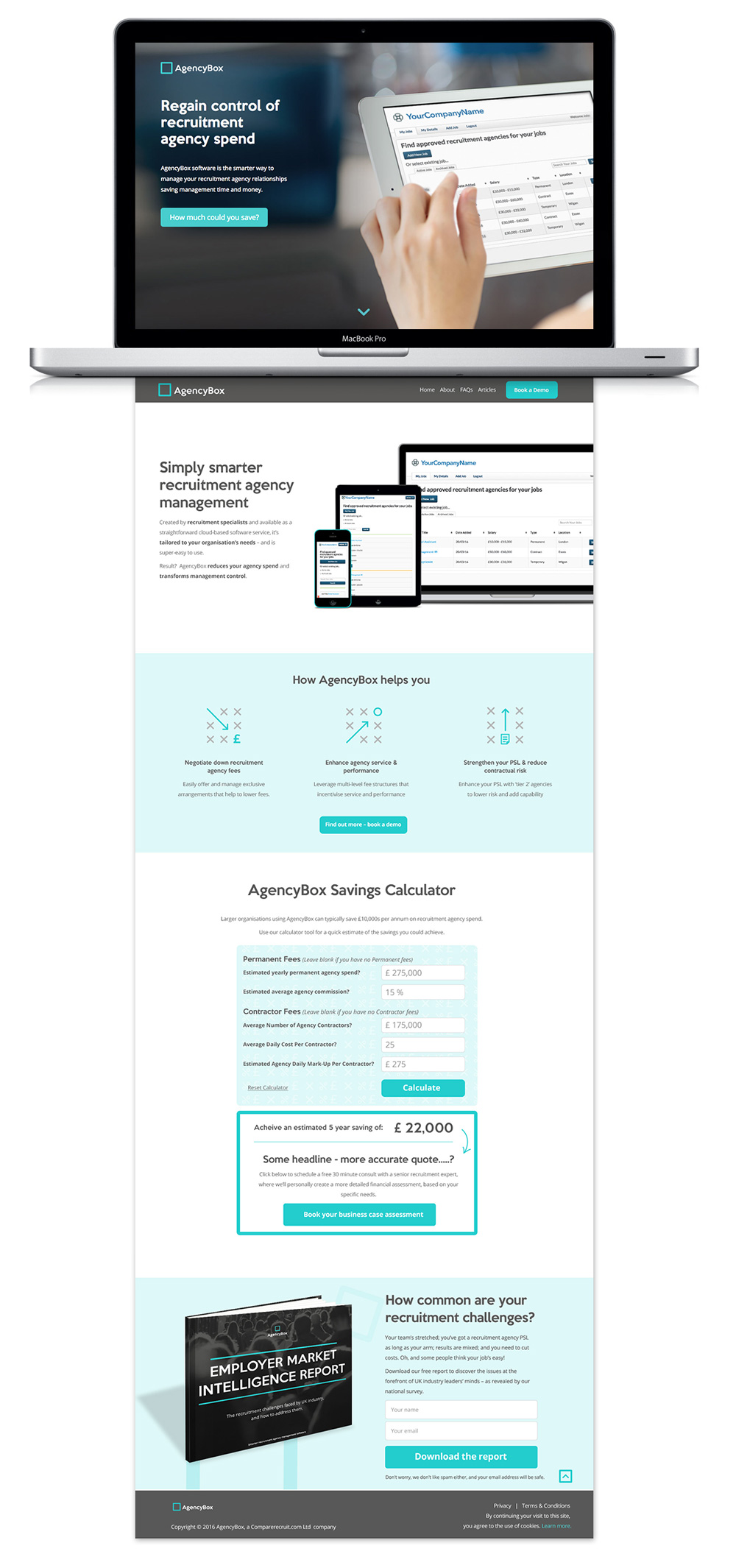
After the branded collateral items were complete, I spent the final stage of our 3-week schedule designing John’s new website. I used consistent fonts and colours, kept the navigation simple, and chose a minimal layout to encorage users to click through and take action.
The site had three main goals:
- To promote a professional, yet innovative corporate design that enhanced their sales process.
- To make it easy to book a demo.
- To build authority and collect emails through offering a free to download industry report on the recruitment management sector.
The result?
The new brand designs and website has given the sales team confidence to promote AgencyBox ? so that in the first two months since launch they secured three new meetings with large corporate clients.

?I believe if it wasn?t for our new brand and website design, large organisations wouldn?t have even considering meeting us. I?d use them again, and unflinchingly recommend Andy at Designbull to other growing businesses who need to build credibility and show expertise.?
John Tsalikis – CEO AgencyBox
The images above don?t quite do it justice. Click here to visit the new website for AgencyBox and try out the savings calculator we created!.?I’m thrilled to add this project to the Designbull?portfolio!
There are many ways to launching a successful brand and website. What is your process for creating a new brand and website?