I’ve been wanting to write this article for a while now. Logos are everywhere, and are the face of a company or organisation. It has to convey it’s brand message across to as many different audiences. So careful design and development needs to be implemented by professionals. But even the professionals get it wrong.
If you are in the brand logo design business then you may have come across a few websites listing some classic bad logo designs. Here are my top 10 logo designs gone wrong and also some, I feel, are just not right?!
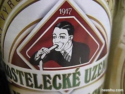
1. Kostelecke Uzeniny logo. Czech sausage company logo since 1917. I’m sure it’s tasty but…
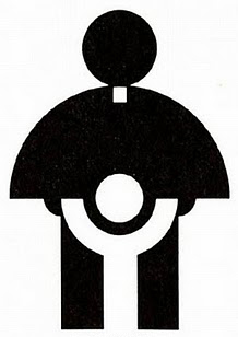
2. Church’s Archdiocesan Youth Commission Logo. The shape and simplicity works well and I imagine this was fine in 1973, but in the wake of all the recent news it’s just wrong.
3. Office of Government Commerce logo 2008 It cost ?14,000 to create from a top London Agency, but no-one realised the fault until seen on pens and mouse mats.

4. SafePlace logo. A ‘touching’ design…

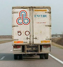
5. Encebe logo. They do meat… and two veg…?
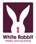
6. White Rabbit logo. Look through their keyhole… or the back end of a rabbit?
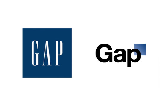
7. New Gap logo (but not anymore…). A big move from their classic logo, which did need a refresh. But not this logo… If you look at their complete brand identity usage, you can see why they went for this modern design. I think It just wasn’t handled properly in the social media.
 8. Capital One Logo. This just feels like it was designed by a committee. The poor swoosh design, squashed typeface. Could be so much better!

9. Bing logo I like the name but it’s another squished typeface from a large company. I imagine the brief to the designer something along the lines of, “yeah, similar to google logo but rounded. And make it look fast.”
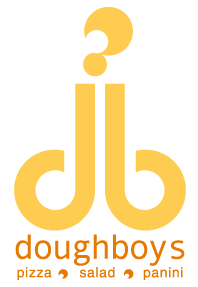
10. Doughboys logo. The db together could have passed, but adding the ‘smoke’ just made it look wrong. (I must admit when I was creating ideas for the Designbull logo, I actually sketched a similar san-serif db side by side on one iteration, but I felt something was wrong about it!)
