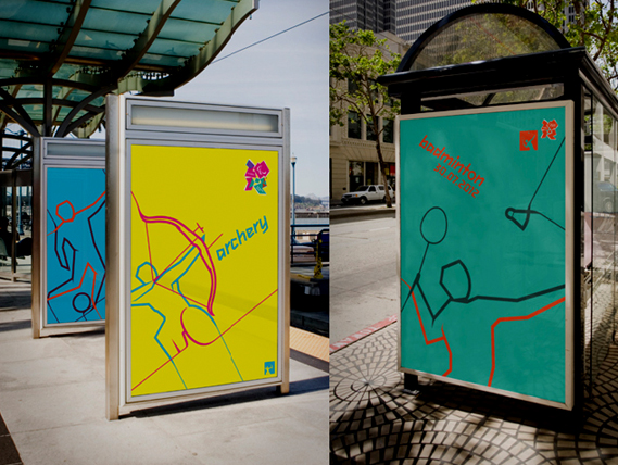
I’ve just downloaded the iPad app for the London Olympics and saw how refreshing the new Olympic icon designs are. I know they’ve probably been commented to death now as they have already received lots of feedback, but I wanted to add my say to the pile.
Taking the style, angles and colours from the main London Olympic logo, these icons fit well into the mix. They do sit comfortably with each other and are unique to the standard sport icons you see everyday. You can see clearly that some of the ‘inspiration’ and colours comes from the classic Art Deco poster of the 1920’s and 30’s.
From the Industrial Revolution to the Technological revolution thats happening now in this century,?Art Deco has always looked ‘modern’ and ‘futuristic’ and sits well 100 years later. But this is how designers work – taking the past styles, looking to the future and mixing it up.
And the outline versions for all the signage and posters, with bright, primary colours denotes flow, vibrancy and speed.
I look forward to seeing the designs over the coming weeks…


