My 3 stage process to creating a professional logo identity
In this article I will reveal?the step by step process I go through in?creating a logo identity for an organisation.?It will provide some?insights into the time taken in not only the thought process behind creating the logo, but also the design?and use of the logo itself.
I was recently approached by one of my consulting clients, to design a new logo identity to replace the initial?logo they were using for a project with various member states they were heading up. Called ‘U-Turn’ – Rethinking Urban Transportation through advanced tools and supply chain collaboration, it is an EU collaborative project dealing with supply chain issues across the European Community.
When creating a logo, you?should follow a logo design process that ensures the final design suits the needs of the clients (not their wants). Below is the usual logo design and?identity?process broken down into three stages:
1. First stage
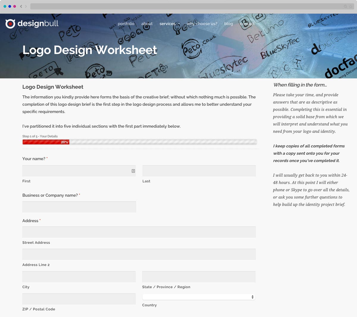
From the initial discussions over the phone, I asked them to?fill out my Logo Design Worksheet?- (I offer the choice of an?online?Worksheet?or as a Word document) This helps formulate a clear understanding of their requirements and confirm what we already started discussing.
The worksheet will ask detailed questions about what they are looking for in a logo, colours, fonts, modern or traditions etc. I also ask?what the logo will be for, where it will be used and who will be making the final decision.
Once they have filled out the logo design worksheet ? which usually takes around 15 to 20 minutes, they receive a copy by email and?I will print out their worksheet and?take notes.
Then we arrange another call to clarify the details. In this session, I tend to offer suggestions and ideas around their thoughts and expectations – this helps guide me in and better understanding their needs.
Each logo identity project is unique and I do have a design process that I follow and works. I alway try to present my logo ideas directly to all stakeholders, either face to face or video conference call as it gives?direct feedback and achieve the best design for the project.?But?sometimes you have to allow for a clients requests. On this occasion, they asked if I could work up three logo options so they could integrate?within their own presentation to their project group. I agreed that I would show these options with mock-ups of how the logos may be used, with detailed design notes so that they could explain each logo idea clearly to the group.
2. Second stage
Once all agreed on the outcomes and delivery, it was now my job to make a start. I usually get?ideas from initial discussions at the start. I?start sketching or doodling and taking notes before anything is agreed – sometimes I work straight on the computer on a typographical approach or graphical idea. It all depends on the project and how ideas come to me.
For this project, I had?worked up initial sketches I had in mind and also after some research.?It gives an insight into the thought processes when working through ideas with a pen or pencil.
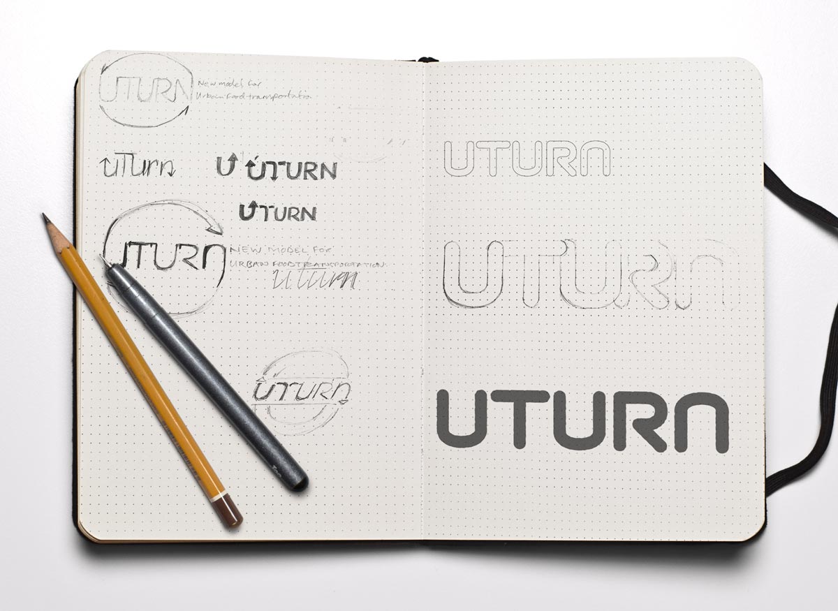
A few of my U-Turn logo sketches shows the ideas and thoughts behind the project
Once?I see something with an idea, I start to develop?this?into vector drawings using Adobe Illustrator on-screen.
I’ll take a picture using my iPhone or camera (I used to have a scanner but now cameras are just as good). It’s quick and keeps?me in the flow of working on the design at hand.
You can see a speeded up video of how I take the sketches and create the vector lines for the U-TURN lettering.
Once I?have converted my?ideas from paper into digital format, I work up around?three logo ideas from the first ideas. I have found that offering too many similar options can make it harder for the client to make a decision. Choosing three or less also makes you decide?based on your understanding of the clients needs and your?experience?as a designer.

Digitally converted ideas – from sketches traced into Adobe Illustrator. Why do I use magenta for the colour? This just helps me see the logo as I trace over the sketch.
On this logo project the colours were already agreed?and so I integrated the colours?into each of?the logo design?ideas.?Coloured logo versions usually come after the logo form has been agreed. This helps keep the focus on each logo design stage.
From the logo design option spreads, you can see I have added in mock-ups of ‘real-world’ uses of the logo and also the ‘Design notes’ for each version. The client will be using the logo initially on reports and presentations so it helps visualise for the client ? and also you as the designer, how the logo may work.
Logo Option 1:
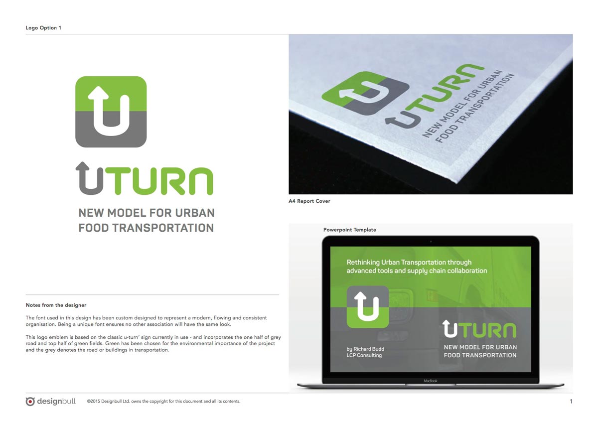
U-Turn Logo options ? with mock-ups for a report cover and presentation. The font used in this design has been custom designed to represent a modern, flowing and consistent organisation. Being a unique font ensures no other association will have the same look.?This logo emblem is based on the classic u-turn? sign currently in use – and incorporates the one half of grey road and top half of green fields.
Logo Option 2:
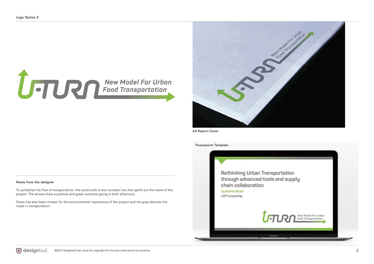
U-Turn Logo options ? with mock-ups for a report cover and presentation. To symbolise the flow of transportation, the word-mark is one constant line that spells out the name of the project. The arrows show a positive and green outcome going in both directions.?Green has also been chosen for the environmental importance of the project and the grey denotes the roads in transportation.
Logo Option 3:
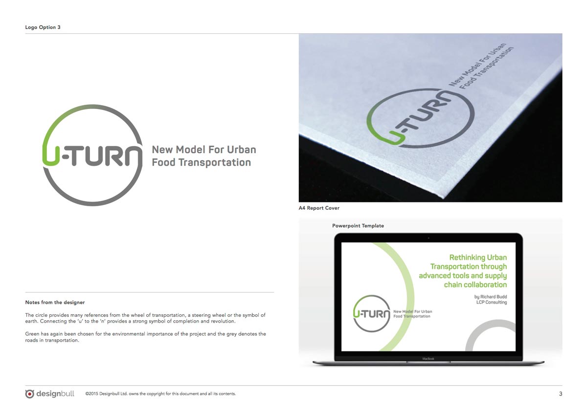
U-Turn Logo options ? with mock-ups for a report cover and presentation. The circle provides many references from the wheel of transportation, a steering wheel or the symbol of earth. Connecting the ?u? to the ?n? provides a strong symbol of completion and revolution.?Green has again been chosen for the environmental importance of the project and the grey denotes the roads in transportation.
3. Third Stage
I presented these to the client over video conference, explaining my thoughts and going over the design notes ? and in turn, the client successfully presented the logo design options as part of their main presentation to the EU group stakeholders. They were well received and all were in agreement to move ahead with Logo Option version 1 – with minimal adjustments.
After receiving the confirmation, I then created a logo pack of the final U-Turn logo ? logo files saved into various formats for print and web (eps, jpg, png, RGB and CMYK).
A4 One-Page Logo Identity Guidelines:
A single page logo identity guideline?document?was also created showing logo usage, safe zones, minimum sizes, clours and fonts used – as well as what NOT to do with the logo.
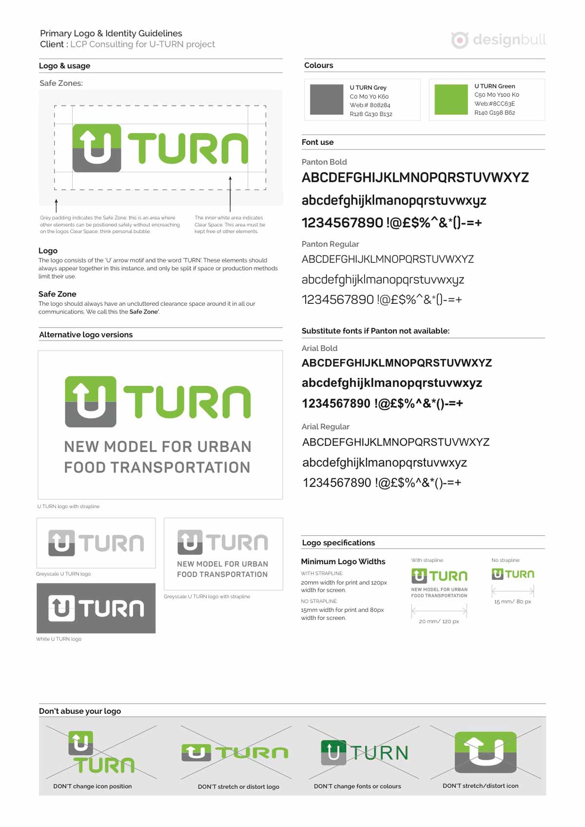
One page logo guidelines makes it easy to understand how to use the final logo.
A4 Microsoft Powerpoint & Word Template Designs:
Finally, templates for Powerpoint and Word were required based incorporating the logo identity guidelines – keeping the design consistent and making it easy for all?stakeholders to create professional looking, internal documents that fit with their new logo identity style.

A Powerpoint template created with the new logo identity.

A Word template also created for report designs as part of their logo identity consistency
