In ye?olden days…
You’d be amazed how typography for the web has come a long way?over the past 15 years. The internet browsers have?supported web fonts since 1997, but only if you?had the specified font installed in your?system. The?default typefaces on offer you could count on one hand;?Arial, Verdana for sans-serif or Times and Georgia for serif fonts to name a few?examples.
As a designer, to stop?fonts defaulting?on these different browsers I?would create the fixed design layout in Photoshop and save it as images. (I was still?working in tables where?a browser would slot all the images?together like a puzzle).
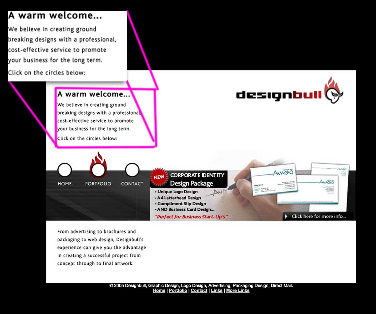
Here’s a screenshot of?my old Designbull website from 2005 showing?one block?of text?as an image. It worked visually as a fixed design – but you can see it breaks down as an image when?enlarged.

An old web design for designbull which used images for text
Another work-around was if you wanted to use the exact font from your branded print materials, you had to convert it into an Adobe Flash format called, Scalable Inman Flash Replacement (sIFR)?which was another ball-ache and only worked if you had Adobe Flash installed and up to date!
Nowadays, typography on the web has taken great leaps for blog-kind ? and you don’t have to be a savvy web designer?to know how to choose a great font. It’s now become?easy?to search?from an unlimited selection of great typefaces – both free and licensed – that will?enhance your website’s look and readability.
It will benefit you?to have a basic?understanding of typefaces if you want to choose and?correctly pair them?so that it aligns with your websites brand style.
So how do you choose the right?typeface for your?website?
Choosing a particular font or typeface can be like putting on the right suit for an important?meeting or event. It says a lot about your style and look and how you present yourself. It can also set the tone or mood to the viewer.
A famous design critic, Rick Poyner sums it up well: “Type is saying things to us all the time. Typefaces express a mood, an atmosphere. They give words a certain colouring.”
There are hundreds of thousands of fonts available on the web. Some are good, and most?are bad?? and you can spend hours just going through font libraries and getting nowhere.

Thousands of good and ‘bad’ fonts can be found on sites such as ‘DaFont’
Many of the fonts you’re going to find are?free fonts and?are not going to be designed well. They may have spacing issues, not have a full set of letters or numerals, and until you start using them, may not look good at all.
A well-designed typeface will not have these issues. The typographic designer understands that details matter. They?will use ever-so-subtle touches and enhancments to make a block of type read elegantly?and with ease, expressing it’s?language while also evoking cultural and emotional factors that shape the typeface.
What do I want my website?to convey?
To give you a basic understanding in choosing your?correct typeface, you have to ask some questions about your ‘brand’ or style?for your website. To give you an idea, professional designers take tremendous care in picking the perfect font to use in their brand projects. Here are just a few a designer might ask:
- What size, or sizes will it be displayed as?
- What technology (screen or paper) will be used to display it?
- What’s the historical context of this typeface?
- Will the information be scanned quickly, or digested linearly?
- Are there any historical or political associations that can be made with this font? (In what country was it designed? In what time period was it designed?)
Once you’ve got these down, you can start to search for your perfect font. But?if you’re new to this, a good understanding?of typographic history can help.
A?serif font suggests tradition (eg. Times, Georgia) and a sans serif font more contemporary (eg. Helvetica, Segoe).

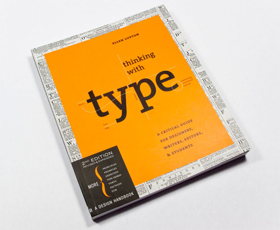
Thinking With Type by Ellen Lupton
There’s a wealth of great articles on typebasics and the history ? and one book I recommend is Thinking with Type, Second Revised and Expanded Edition: A Critical Guide for Designers, Writers, Editors, and Students (Design Briefs)?by Ellen Lupton.
A match made in heaven
Once you’re clear on your what type-style you’re aiming for, this helps narrow down your search. Font directories such as Google Fonts offer free fonts that you can use.

Google Fonts are free and well designed for the screen
Professional?font libraries I use to?purchase fonts from are MyFonts?which have some great, modern fonts starting from?around $15 each. Or sign up to some design offer newsletters for regular deals on fonts. Mighty Deals is great resource ? and only recently I purchased?the Panton font family for only $29 (normally costs $290).
This?Designbull site and my logo mark use a sans serif typeface?called Raleway from the Google Fonts collection. And I have a second font that compliments this which I use within the website for pull-out quotes, italics and testimonials. This font is?called Droid Serif.
Don’t use the Google font pairing tool ? it is actually a”popular pairings” algorithm. Google searches through their listed sites and has only recognised?that these fonts are used together commonly. It’s not great at font pairing?so steer clear.
If you’re starting out, it’s better to stick to one font as your main typeface for your website with a complimentary font for highlights. There is almost never anything to be gained from worrying about pairing fonts at all.
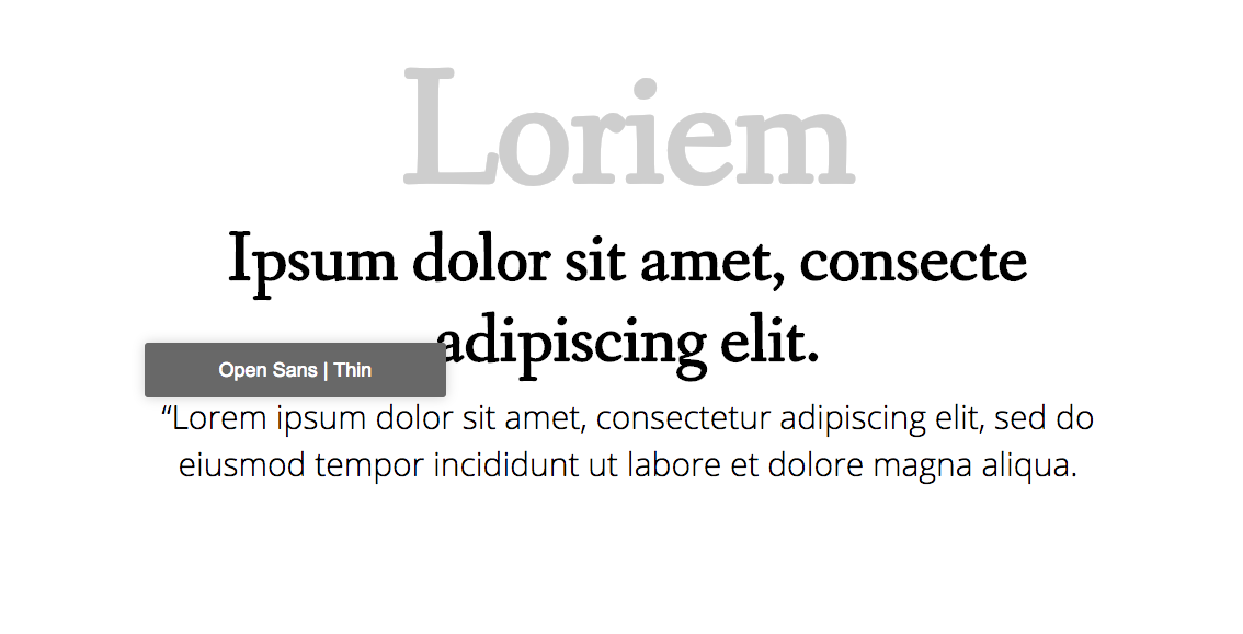
But if you need help pairing fonts, a good font pairing tool to use is Font Combinations by Bold that showcases pairings from Google Fonts. You select a font, then it loads up a selection of fonts that match within the browser:

In conclusion
Fonts can make a huge?difference in what your website?conveys, but you can get most of the effect you’re looking for by choosing your ONE font from just a few well-designed and functional?fonts.
Restricting your choices to just a few different fonts?helps to make an informed decision and know that they will work well. A few suggestions that I have used consistently?for various projects?are:
- Raleway for a more modern geometric look
- Georgia for a sophisticated, yet friendly serif font
- Open Sans?for a clean, classic and neutral design
- Lato for a friendly and “natural” look
From just these four choices, you could transform a website or blog, to look consistent, safe and easy to read. This can?give you more time to?focus on the great content you’ll start to produce – and watch as more readers view your site for longer!
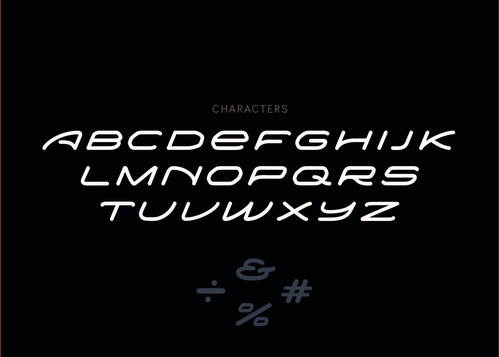
Download my new font!
I’ve now created my first font design you can download and use. A display font, that contains all uppercase characters, numbers and punctuation.
Sources of reference and further reading:
David Kadavy’s blog has?great articles and courses for budding designers.
MyFonts?provide professional?modern fonts starting from?around $15 each.
Mighty Deals is a great resource for general?design and website offers.
Google Fonts offer free fonts that you can use.

