Have you ever wondered how that app or website on your mobile device was designed? Or have you ever thought about having a go at designing an app or website yourself?
If you have an idea for an app and are struggling to explain it to people, spend a few minutes reading this article and have a go yourself 🙂
—
I’m a UI/UX designer as well as a brand and logo designer and wanted to show you a short step by step process to quickly create a working prototype to test it out for yourself before you hand it over to a designer or developer.
I’m using an example app design I created for Going-There.com called ‘gt2go’. It’s a web app, which is designed for viewing in browsers on mobile and desktop – and also for mobiles. Going-There.com offers as a service, detailed city guides for relocation companies and their employees.
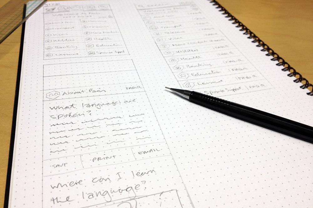
As part of the branding and design for the Going-There.com website, they required a user-friendly app for mobile. Taking their ideas and brief requirements, I first sketched out a few mobile screen layouts for the app in my sketchbook – or you can use the back of a napkin if you’re a budding entrepreneur 🙂

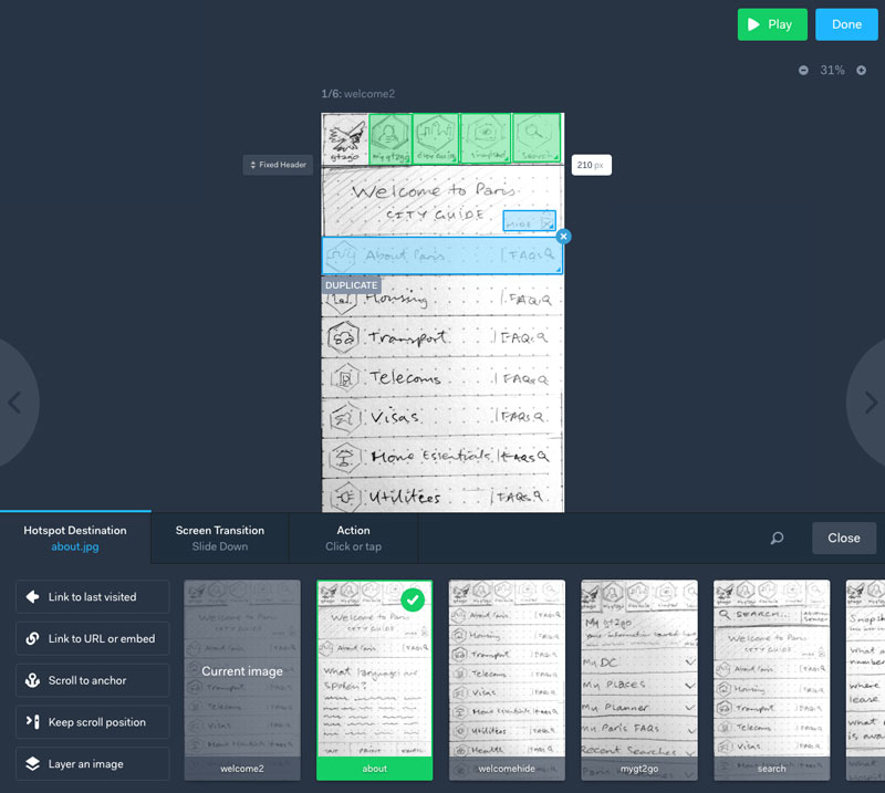
Then I took pics of each one, using the prototyping tool, Marvel to preview and demo how the basic functionality of the app will work. (Marvel lets you link up your sketches, wireframes and designs to create realistic prototypes in seconds, no matter what your technical level!)
Once you have uploaded your screens, you can add hotlinks, set animated transitions – like swipe left or right, hover, fade in and out.

Below are?the current sketched roughs of the screens I’m working on within the Marvelapp previewer. You can play around with it, scroll, click the links. Click to view with the prototype:
It is previewed live inside an iPhone frame. Or within the Marvel app. And it automatically recognises when you make changes or updates to your designs and updates prototypes automatically without having to re-upload or set it up again.
This a great way to quickly show someone your idea and functionality, make adjustments and flesh out your user-journey before you start on UI/UX designs to create a pixel-perfect branded prototype.
Here’s the final prototype design, which was used then to help the client brief a developer on the requirements: Click to view final prototype design
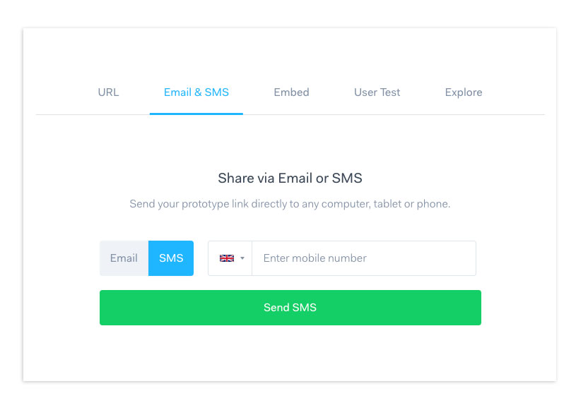
And to try it out on your iPhone, you can get it sent as a link directly to your phone. Click the ‘Share’ button in Marvel and you’ll be given a pop-up with options. I used ‘Email& SMS’.

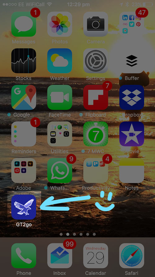
So you can send it to anyone with a mobile and they?can open it up directly on their phone, save it as an ‘App icon’. See below screenshots. Once you receive the text, you click the link, and it takes you to your phones mobile web browser, then it asks you if you would like to install this prototype on your homescreen like a ‘real’ app. Simple 🙂


Updated – My current design workflow tool I use:
I now have moved on to a few other tools that help me better design and prototype brand and UI design for clients.
Figma is a design and prototyping tool I’ve been using for over a year now and pretty much replaces my UX and UI design workflow I showed you above – using just the one tool!

Milanote is another go to tool that is great for creating project mood boards, user journeys and sharing with a client your progress. You can also upload PDF files, Word docs and Google docs that can be viewed within Milanote!
Here’s a screenshot within Milanote of a brand and website design client project that shows all the project files, to do lists and imagery:

These tools above are also browser based, meaning you can log on wherever there’s a browser and start working on your designs. You don’t need to download and install their apps to get started, and both Figma and Milanote come with a FREE account forever to use (you only pay for when you start to build you work and projects up).
What tools do you use to create your apps or products? I’d love to check out what you have created using your process.
And if you’re struggling with your app or website UX UI design, contact me for help 🙂