Typography in logo design is a fine art and when you combine this with creating?lettering out of?foodstuff ? the results can be quite stunning.
The practise of creating food lettering is a popular approach in the design industry and can make your designs?eye-catching and more shareable to your audience!
All you need is:
- a room with no draughts (close the windows, turn off the fans)
- a steady hand.
- lots of?practice.?Try out a few tools to shape your food typography. (We used toothpicks, scalpels and plastic tabs for?the BodyMe food supplement logo.)
- Patience. It takes time, so don’t rush it.
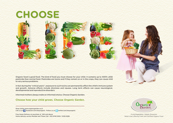
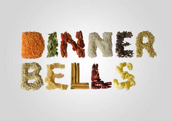
Do some research and see how others artists and designers have approached it – some are very good and make a good living from just this. One person who?creates this?style of work?is?Becca Clason.?Have a look at a few of her work examples below:

When creating the BodyMe?supplements food lettering, we researched how food lettering is used for different formats?and found?references of images that gave us an idea of how our lettering might look like once complete.
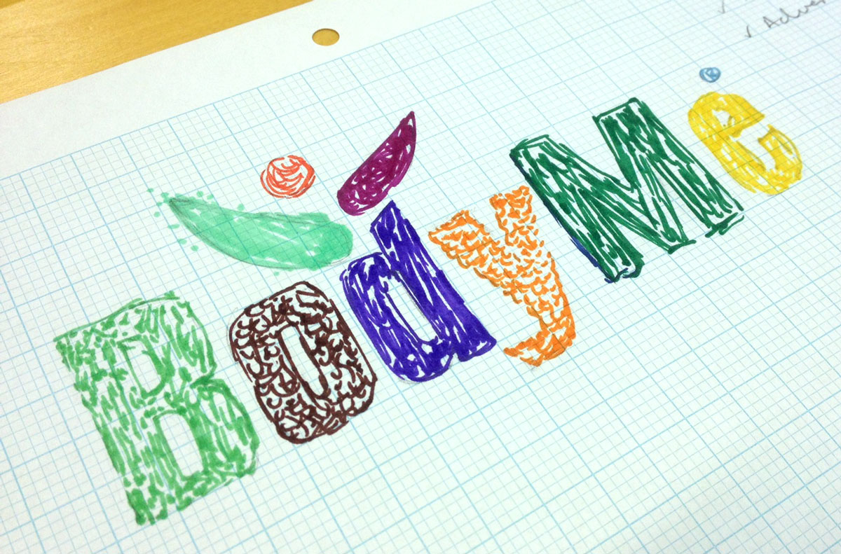
Once we had an?idea of what it might?look like, I sketched out a coloured rough to see if it would work.
and then set to work creating the lettering. You can see the faint dotted guidelines we drew onto the paper to help guide us around the edges. (David Bush helping me out in the picture)
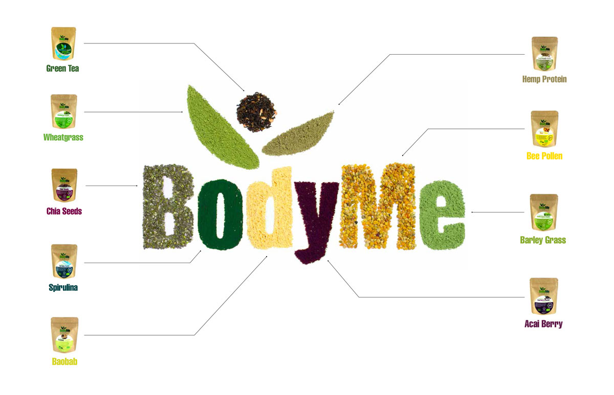
and the final lettering after retouching…
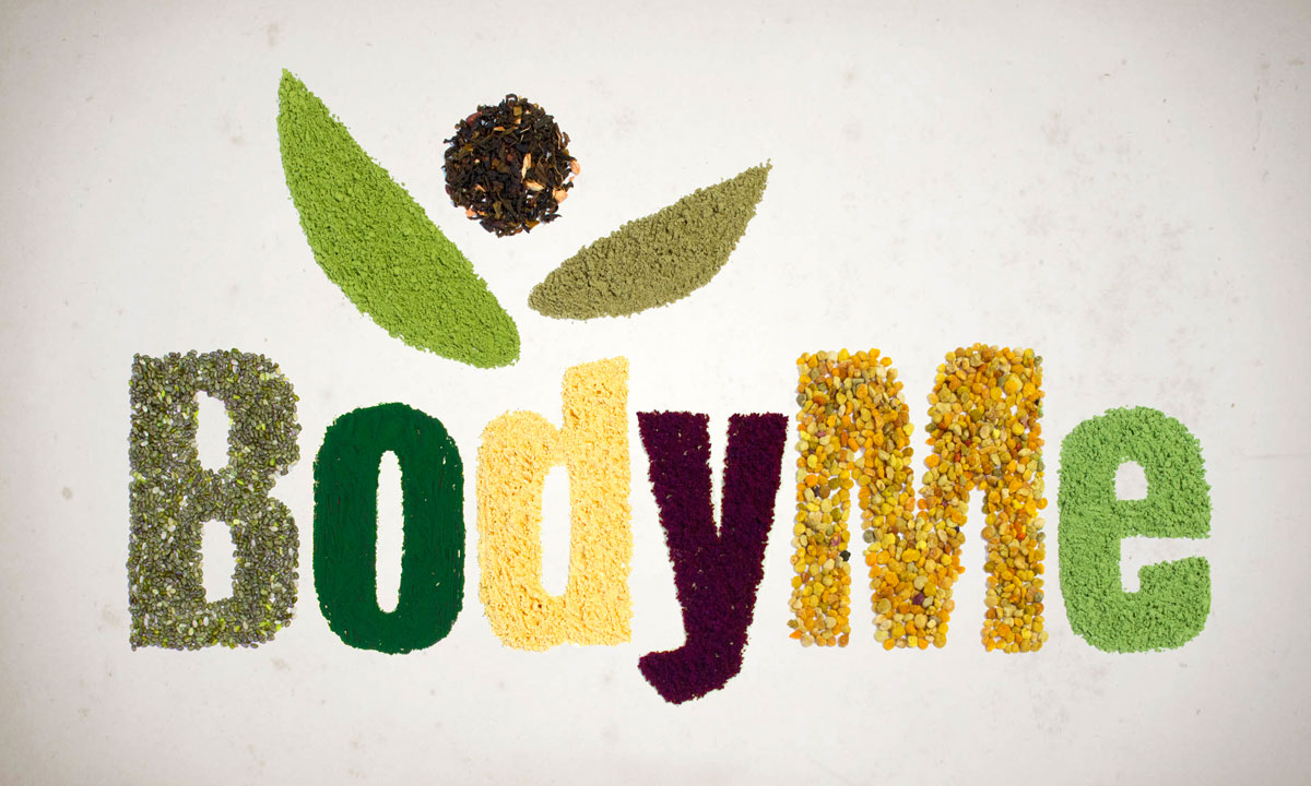
And how it may work as a poster graphic…

